
Abstract Photography
- gpahl10
- Jan 6
- 1 min read
Updated: Jan 8
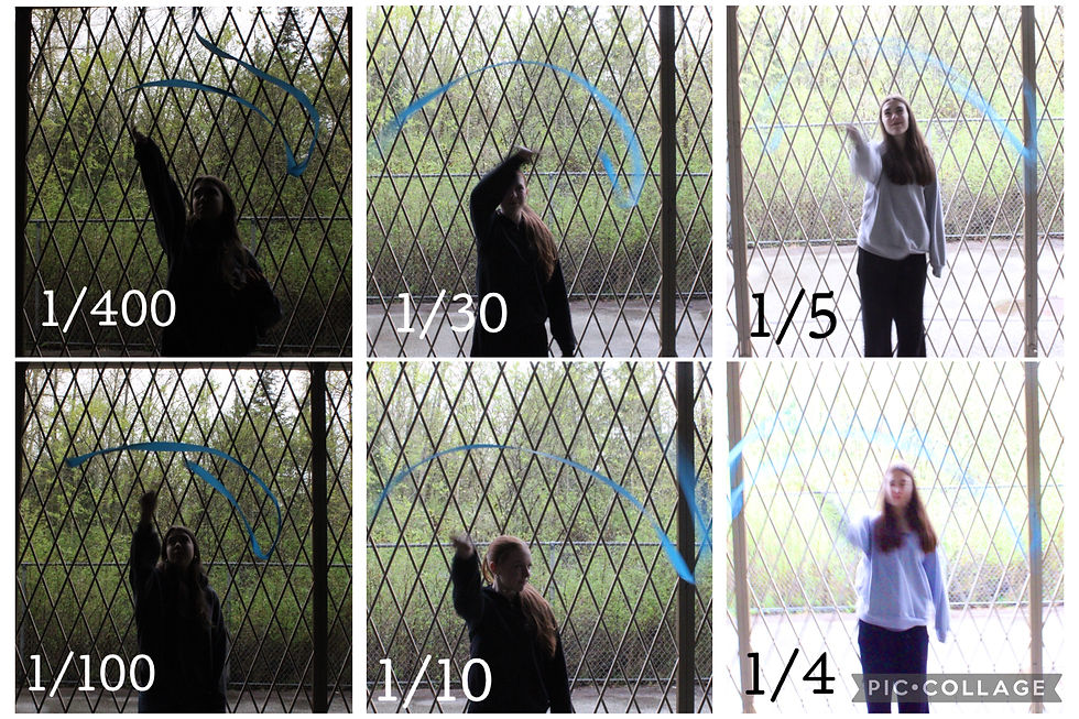
1: In photo number one there is a use of texture (surface quality in the photo) as-well as unity (harmony in all aspects of the photo). the texture of the photo is slightly distracting to the painting and photo itself when it comes to the holes in the wall however the streaks of paint you can see bring the piece together in a way. The unity of photo number one is all of the different shapes and colours coming together in a way that just makes sense when you look at it. One thing that could have been done better was handling the blur and focus of the camera onto the art. it was a bit blurry and I feel that if I had been a bit more stable in my hand and taken more pictures of this image to get it jus right it would have looked even better than it already is.
2: value emphasis) In photo number two there is a use of value (the range of light to dark) and emphasis (focusing on the ornament and the range of hue). The value in the photo is the way the light goes from bright to dark and has your eye focus on that area.
3: colour (hue) blurry emphasis
4: colour blurry unity or contrast
5: texture balance


Comments